

















It's Nice That
Brand identity for a new editorial series
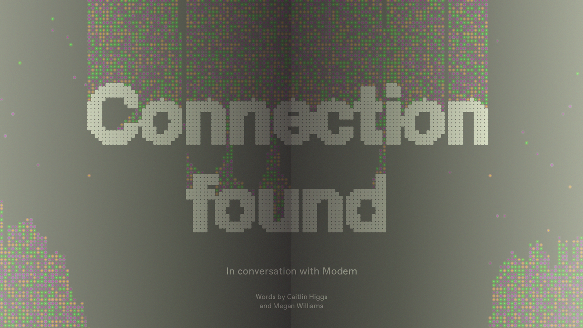
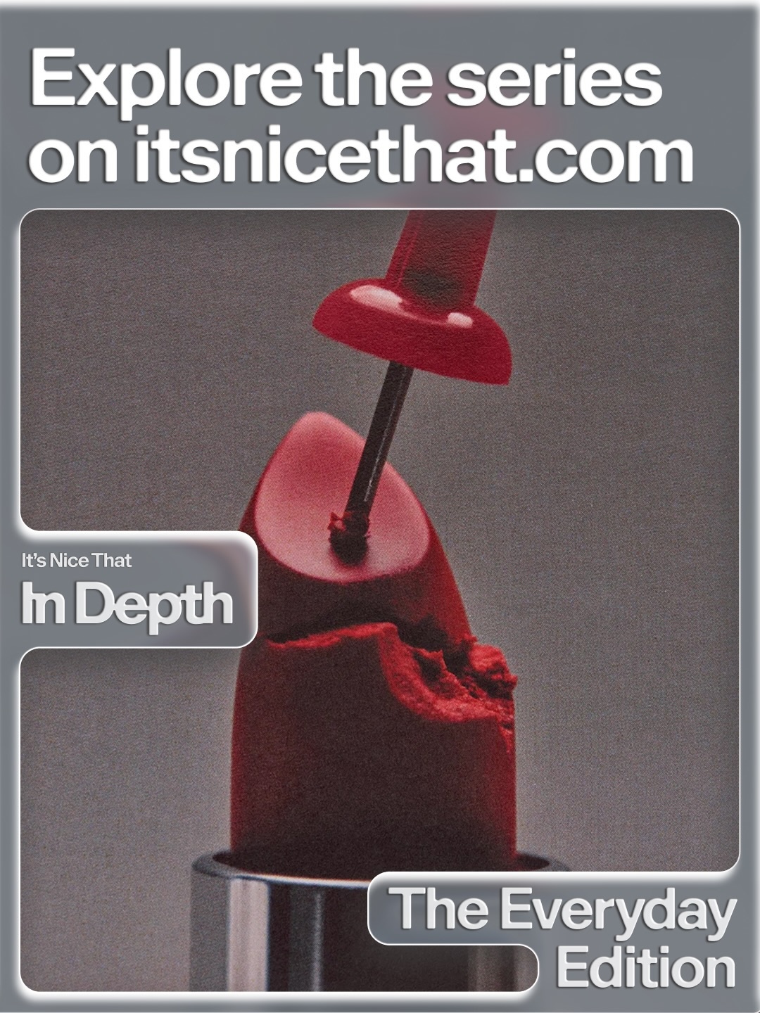
It’s Nice That In Depth is a series of “online magazines”—a set of articles and social content crafted under one theme, going beneath the surface of the topics at the top of the creative agenda.
The themed editions explore subjects affecting creatives’ work and lives, helping them to understand the current landscape, get inspired, face challenges, and ultimately create their best work. Each edition contains long-form features, interviews, opinions, and creative projects, dissecting the theme from all perspectives.
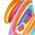
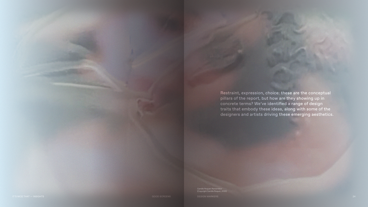
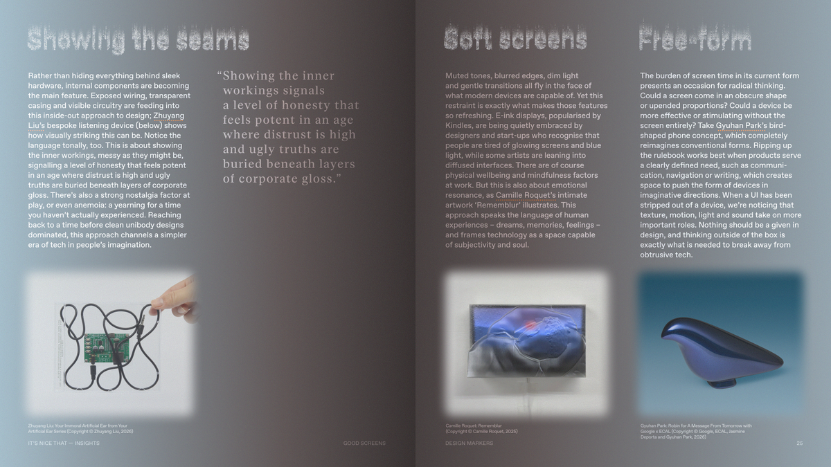
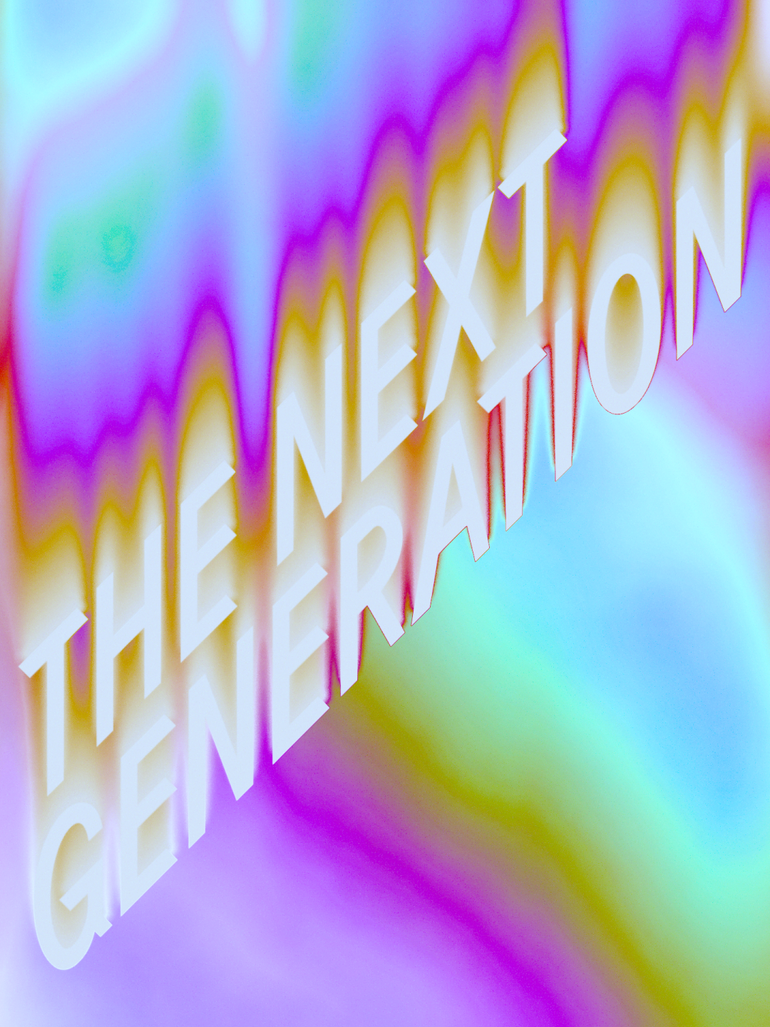
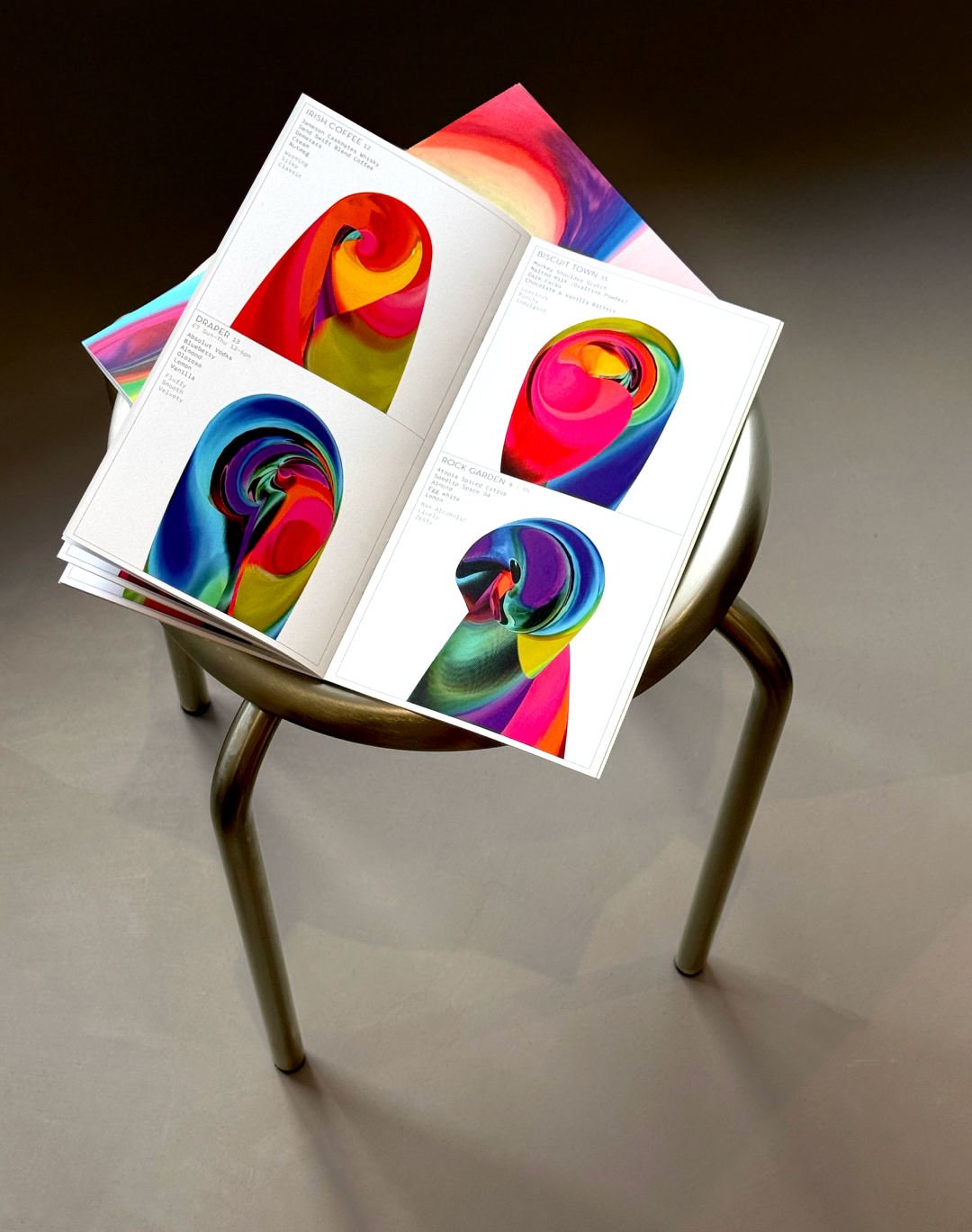
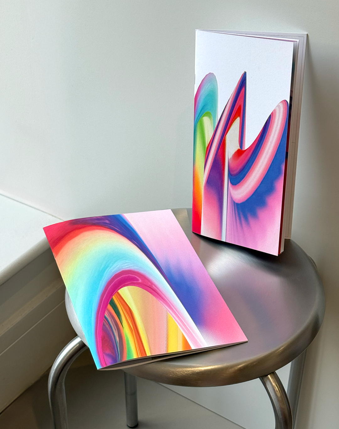
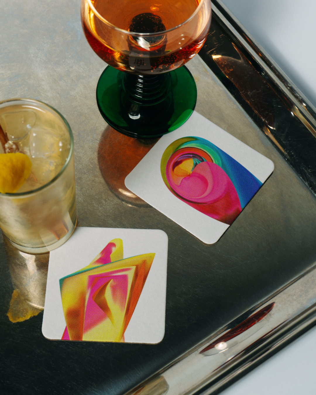
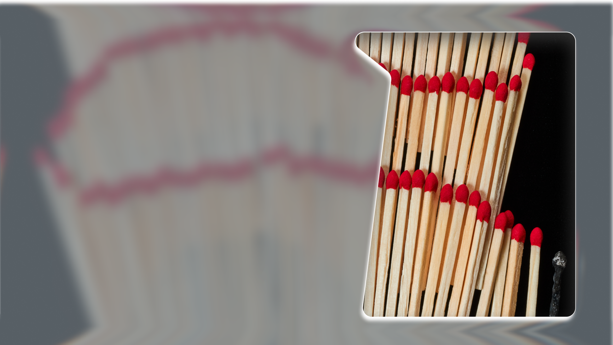
The concept captures the series' core mission of "going deeper." To visually pull the reader in, the system acts as a thick, viscous lens, creating a tactile illusion of depth so users feel they are looking through a physical layer to access the content.
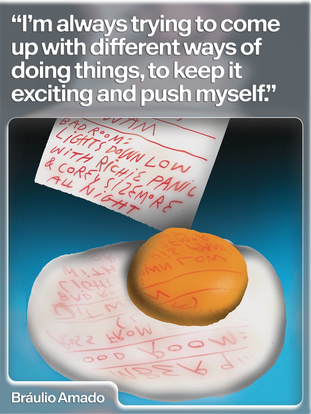
The design system ensures the series is instantly recognizable while keeping each edition exciting. We delivered an adaptable toolkit that allows the internal team to easily roll out cohesive new releases across web and social platforms.
To differentiate these editions, the system relies on dynamic colour shifts. Each utilizes a distinct palette designed to mimic coloured acetate, starting with grey for the inaugural Everyday Edition.
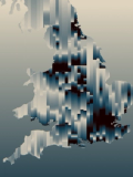
Behind the scenes, we built a generative tool used to experiment with motion and form to directly inform the physics, flow, and visual behaviour of the final design.
Creative direction:
Natalia Witwicka
Design:
Nikita Steinberg
Art direction:
Simon Smith
Design roll-out:
Saskia Vokes
Amy Sproson
Typeface:
Customised Facility from Optimo
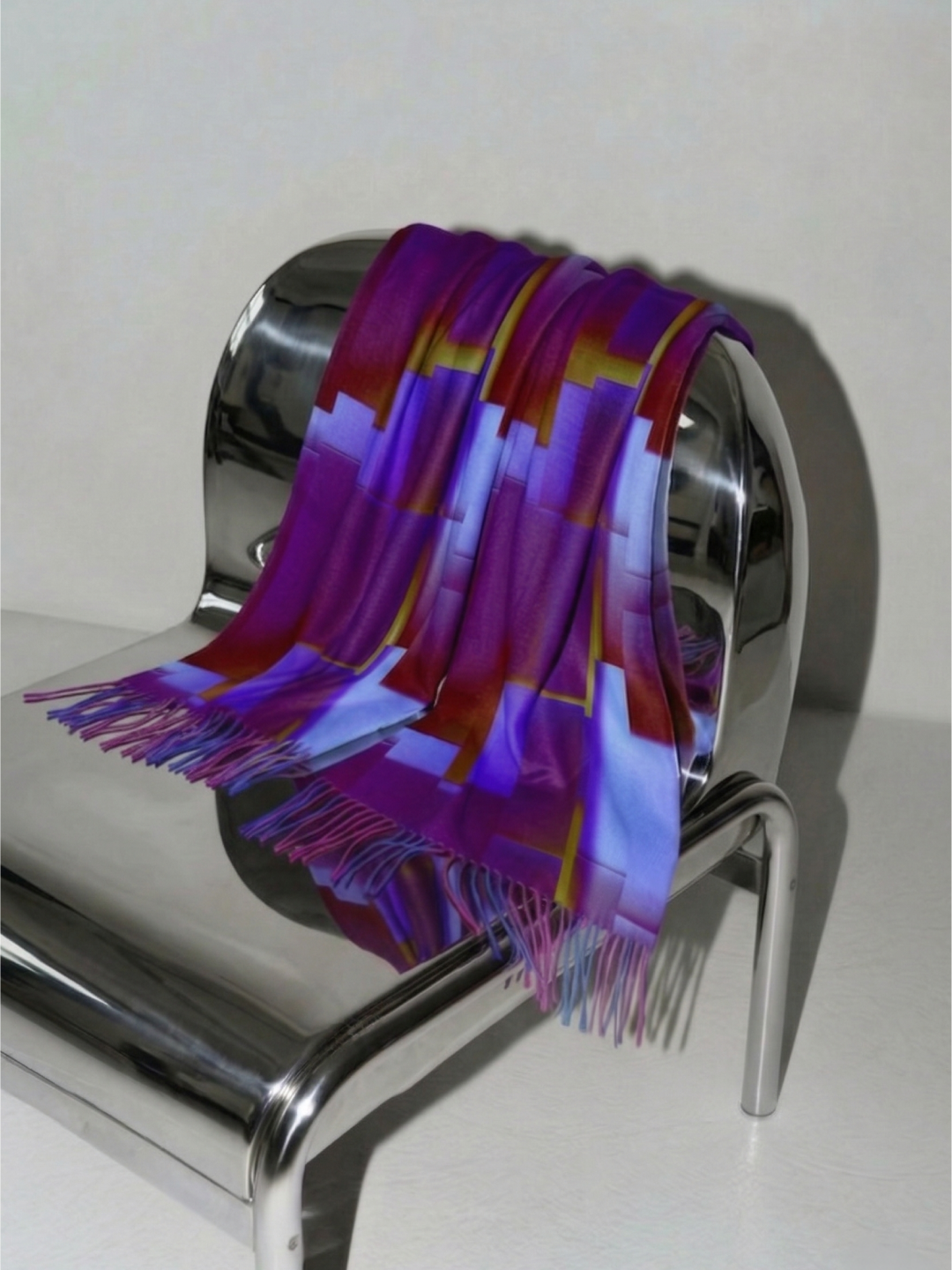
Imagery:
@karolinaburlikowska
@braulioamado
@byluciapham
@shelley_horan
@edie_med
@ade3